 Blog
Blog 12 Days of InFlow - DriveWorks Responsive Forms
I can’t believe we’re already to day 6 in our countdown. We’ve had some great content so far, and if you missed any of it, be sure to check them out! Since I’m back, that must mean I’m going to tell you another story of how the elves use DriveWorks to automate the creation of all things Christmas. I have a fun one for you today. They wanted me to tell you all about how they use responsive forms so their forms will look great on any device.
What are Responsive Forms?
Using responsive forms is a way of making your DriveWorks forms able to respond to changes in the environment. No, I’m not talking about the snow and cold that comes with December in the North Pole. I’m talking about the device you’re using right now! The point of responsive forms is that your DriveWorks projects will look great on a cell phone, tablet, or a 4K projector. One of the concerns that the elves voiced to me in our calls was that they had seen websites where you would have to scroll for a few seconds to get to the far side. Nobody wants to have a website like that. It makes for a difficult user experience. We want a great user experience, no matter what device they’re using.
How do they work?
Responsive forms are created using the size and location properties under the layout tab for each form control. By manipulating the values, we make forms that will always look fantastic.
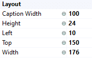
Layout Controls
See those gray dots? They are indicating that the values for those properties are each static. We can double-click to change them to dynamic and write rules for each of them.
But that’s only half of the battle.
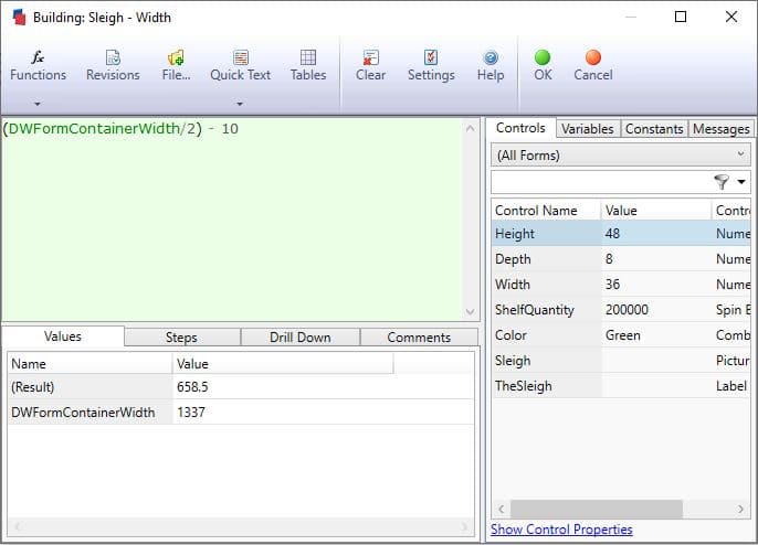
How do you write rules for the size of your screen? That’s not something quick to look up, like an “if” statement. There are a couple properties you can use with DriveWorks that are called the form container sizes. The form container height and width will return the values for the size of the current web-browser. This let’s us create responsive forms
How about an example?
Examples make everything easier to understand, so let’s go through one. Imagine for a moment that you make something like say… a sleigh. The kinds of presents change every year for Christmas. So, you didn’t really think that it was the same sleigh every year, did you?
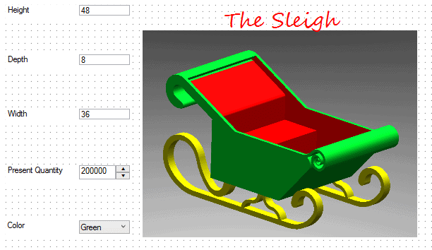
Our current DriveWorks form is in the early stages, but I want to get going on the responsive forms. I want the picture on the right to always be the right half of the screen. I’ll add a slight buffer as well to make sure we have a little bit of margin. My rule for the width of the picture box would then be:
Now this sleigh on my forms will resize and look fantastic on my new cell phone the elves are making! I can also expect the same great looking results on my laptop while I’m testing and building my project. I can keep going with the height of my picture and the properties of my other controls, but based on that smell, it’s almost time to get my cookies out of the oven, so I’ll wrap this up!
Wrap it up
Responsive forms are a great way to make your DriveWorks projects look great on any device. We all want the project to look great for whoever is using it, and responsive forms help us accomplish exactly that. The elves were really excited when I showed them this and are busy putting the finishing touches on their forms now. What will your forms look like with responsive controls?
~Nick