 Blog
Blog Pretty form validation in DriveWorks
I’ve always liked how DriveWorksXpress handles form validation.
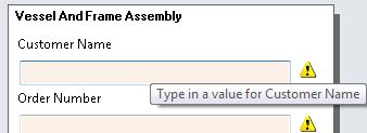
When you build the form, you tell DriveWorksXpress what type of data you want (text or number) and if it is a number, tell it the range of numbers you will accept. With no more setup than that, the validation output looks like the image above -if there is a validation issue, the field is pinkish and a tooltip is available to help the user fix the issue.
This seems a bit nicer than how DriveWorks Solo does validation by default:
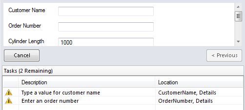
This isn’t terrible, but I want my users to see the issues right on the form, and not have to look in the tasks pane.
The other day I was complaining of this issue to Great Aunt Eleanor, she rolled her eyes, pulled down at the corers of her mouth and looked at me like I was the biggest numskull she ever laid eyes on. Finally she showed me this setup:
Create the text box on the form as usual, but add rules in the properties to mimic what DriveWorksXpress does.
Under the “Background Color” property, you’ll see she created an if/then statement that says if the value for the customer name is empty, make the color “LightPink” otherwise leave it “White”. The logic is the same for the tooltip, if the customer name is empty, show a helpful tooltip reminding your user that you need a value, otherwise don’t show a tooltip.
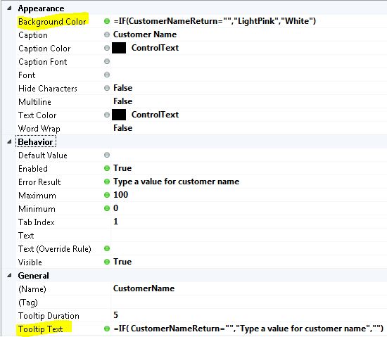
By default, both of these properties are static. (They’ll have a little gray circle next to them -like what you see next to the “Caption Color”.) Static properties do not change while your user populates the forms. However you can convert these static properties to rule based, by double clicking on the gray circle, the circle will then turn green, then you can build a rules similar to these above.