SOLIDWORKS Visualize Appearance Textures for Dummies Like Me
In a recent 10-4 Tech Talk I gave a quick overview of SOLIDWORKS Visualize and covered when to consider PhotoView 360 or SOLIDWORKS Visualize for your rendering needs. The latter I covered in more depth in my blog post SOLIDWORKS Visualize vs. PhotoView 360: When Do I use What?. The subject of Visualize seems to be interesting to quite a few people so I’ll try and dive a bit deeper on a few of the topics over the course of the next couple of blog posts, so subscribe if you want to follow along!
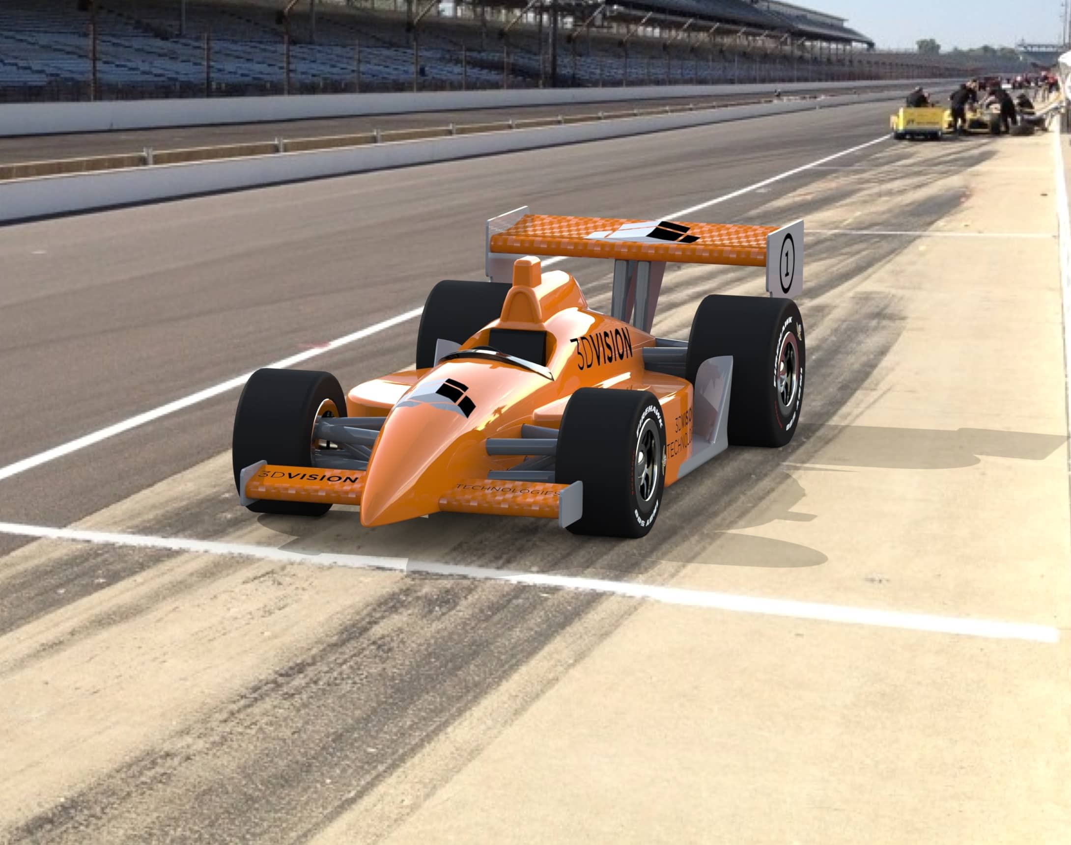
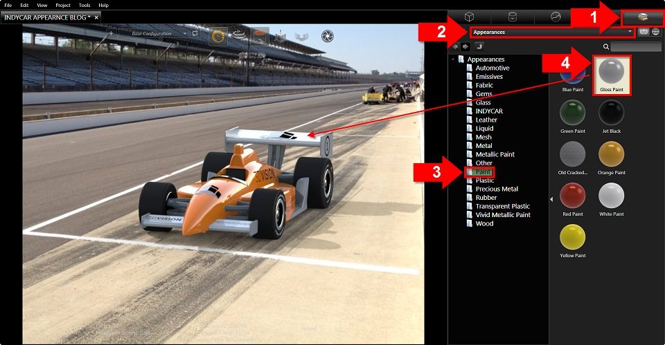
Appearances in Visualize are pretty awesome, it’s just a matter of dragging and dropping the appearance you want to the part of your model you want to have that appearance. But what takes a rendering to the next level is the use of Appearance Textures. Some appearances in the library have already defined textures, but in the case of the IndyCar I worked on, I wanted to give the front and rear wings a carbon fiber look that is closer to what is used on the actual cars.
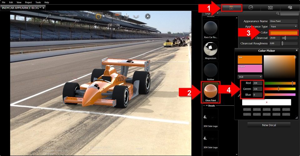
I started with a gloss paint from the library and adjusted the color to match our 3DVision Technologies Orange. I happen to know the RGB value for that color, so I went ahead and used that.
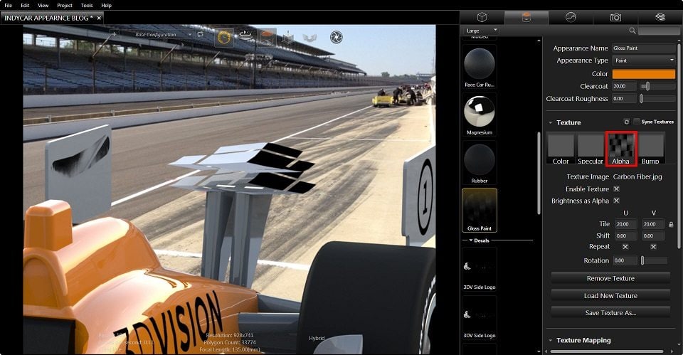
Once I have the color all set, then I wanted to adjust the texture to get the carbon fiber look I was after. But when you look at the texture there are four different options of Texture mapping. The first is “Color”, so if I use the “Load Texture” and select the Carbon Fiber image the result is way off!
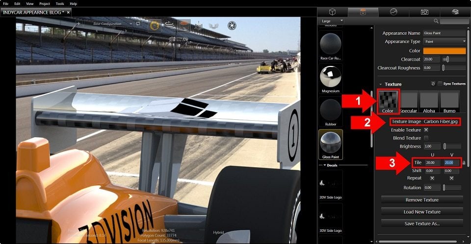
What Visualize did was wrap the part with that image file, so the color of the image file was used. I adjusted the size of the map to be closer to what I wanted in step 3 above. You can also use the “Lock/Unlock” right next to the “Tile” to skew the image if needed. The “Shift will move the map around and the Rotate will Spin the image if that’s needed.
Since that didn’t work I need to remove that texture and try something else. Next I’ll try “Alpha” to see if that gets the texture I want. “But Brandon, the next option to pick is ‘Specular’ shouldn’t you use that?” This is my blog and I’ll follow the order that I want! As I was saying, let’s try Alpha and see what we get.
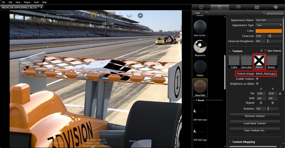
As you can see I’ve successfully made the wing disappear. TA DA! What happened? Well, the Alpha texture maps transparency to the part, so everywhere there is color in the image file used, Visualize will make that transparent. Since the carbon fiber image used has black and grey, the whole wing disappeared. If I use a different texture map, like “Mesh_Alpha” you can see what I mean.
Since Alpha isn’t what I want, I can try Bump. “But what about Specular?” If you don’t knock it off I’ll turn this car right around!
Ok that was dumb, but it was fun for me. Now back to our regularly scheduled programming. Let’s apply Bump as the texture and see what we get. In this case, I’ll bump up the Bump Strenth to the max so we can see what’s really happening here.
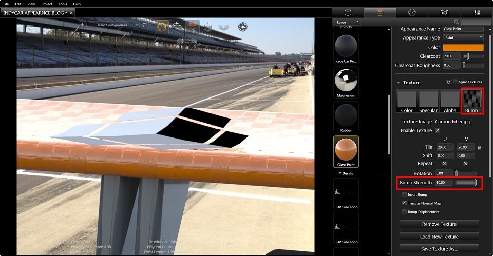
NOW THAT’S TEXTURE! Bump actually gives the part true “texture” in the conventional sense that the surface has raised portions based on the image that is used. Bump texture is awesome for giving true real world appearances without having to deal with complex CAD surface modeling. It’s a great tool and definitely powerful for creating magazine quality images that look true to their final manufactured appearance. In our case though, the carbon fiber of this IndyCar is super smooth and under a heavy clearcoat, so we don’t want any raised bumpy surfaces. So what we really want to use in this case is a Specular texture.
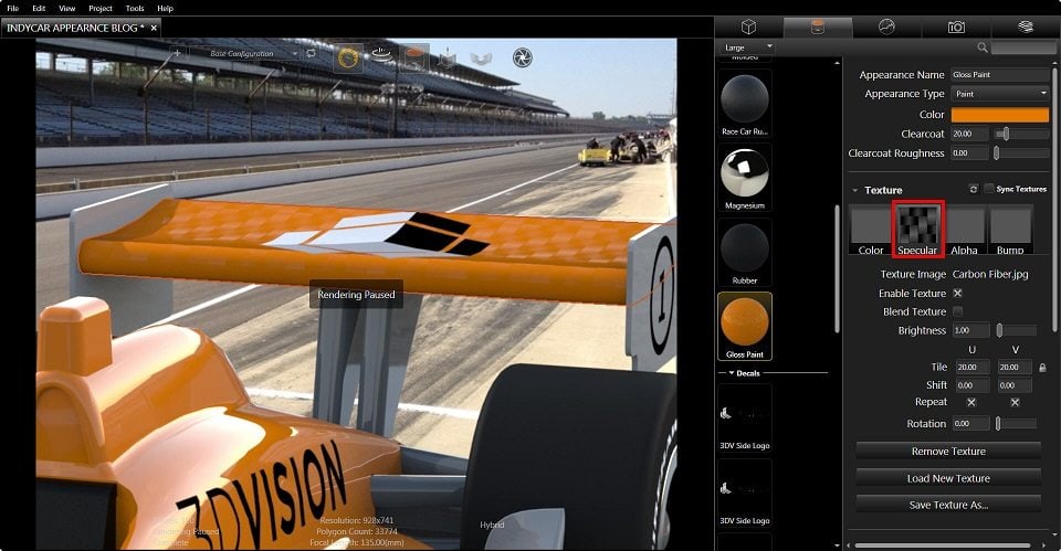
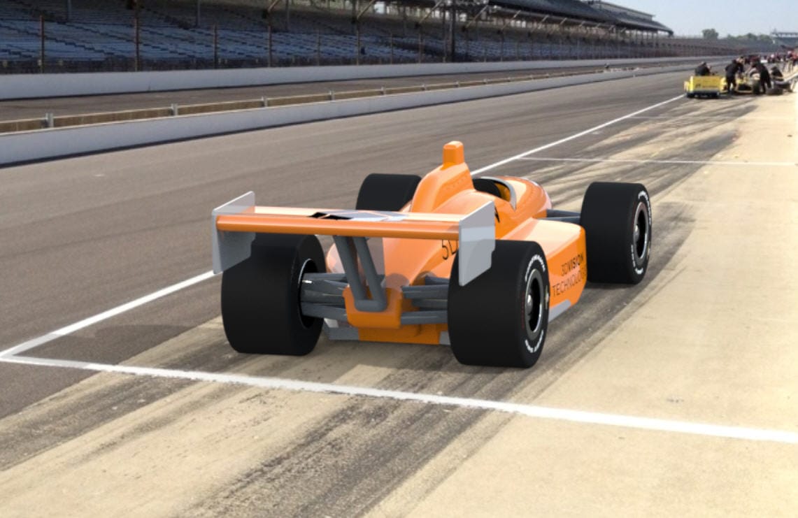
This is the texture mapping we’re looking for with this appearance. Specular mapping defines the shininess and highlights, which in this application is what we’re looking to achieve. The problem now is the wing looks too dull, which makes sense because specular mapping defines certain areas to be brighter than others. We can tweak this appearance to help give the wing a smoother shinier look by adjusting the brightness of the texture map.
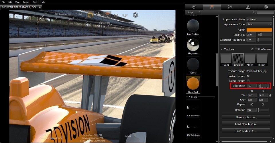
This gives us a better looking image by highlighting the grey from the image file a little better. But the black used in the image still looks a little duller than I’d like and if I keep adjusting the brightness the lighter parts of the carbon fiber become too bright, almost white. In this case I can help give the whole appearance a brighter and clearer shine by adjusting the paint clearcoat. If I increase the clearcoat I can get the final appearance for my image.

So now do you see why I saved Specular for last? I wouldn’t have been able to write this whole blog if I followed the left to right order of the textures. I don’t think that’s how rhetorical questions work…
If you have any questions or have specific areas of SOLIDWORKS Visualize you’d like to know more about please post them below in the comments section below!
Brandon Nelms
Application Engineer
Computer Aided Technology, Inc